OnePlus 7T Pro McLaren best review
Monday, March 23, 2020
1


Introduction
The McLaren OnePlus 7T Pro is a flagship phone for 2019, following last year's OnePlus 6T as the second model in the series. The OnePlus 7T Pro McLaren is a latest and great mobile that OnePlus has discovered. McLaren advantage is. OnePlus 7T Pro McLaren camera is better than the Oneplus 7T. Processor of the Oneplus 7T and One Plus 7T Pro is same. Oneplus 7T Pro McLaren is 5G mobile phone.The OnePlus 7T Pro McLaren has something to do with the car company.Which is why it is mostly called McLaren. Along with OnePlus 7T Pro McLaren name is McLaren name which is very fast car which is why mobile is also known as fast Mobile. you can see the specification of that.
OnePlus 7T Pro McLaren edition Specs
| Disply | 6,67 inches |
| Color | Papaya Orange |
| Thickness | 8.8 mm |
| Height | 162.6 mm |
| Network | GSM/CDMA/HSPA/LTE/5G |
| Built Material | Back: Gorilla Glass |
| Launch | 2019,October Available. Released 2019,December |
| SIM | Dual Sim(Nano-SIM,dial stand-by) |
| Dimensions | 162.6*75.9*8.8mm(6.40*2.99*0.35in) |
| Memory | 256GB , 12GB RAM |
| Main Camera | Triple 48MP, 8MP 3x optical zoom, 16 MP(ultrawide) |
| Selfie Camera | Single Motorized pop-up 16MP |
| Weight | 206 g |
| Battery | non-removable li-Po 4085 mAh battery |
| Fast charging | 30W |
| Fingerprint | under display,optical |
| Processor | Qualcomm Snapdragon 855 Plus |
| Price | 859€ |
Oneplus 7T Pro McLaren Box
The McLaren 7T Pro's long box looks like a premium drink, and it's longer than the standard 7T Pro's red box.The box is wrapped in a diamond-shaped orange outer layer, in addition to a McLaren sticker stating that it is officially authorized to manufacture.
Only the cladding can be seen from the outside, and the phone box is located in layers of orange wrapping paper. The phone case, like last year, has a black carbon fiber texture.
The inner packaging is familiar. The thin envelope is made of paper. The normal style also has a transparent protective case, but it is not here.
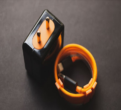
The distinctive feature of the McLaren 6T Pro last year is the charging head and cable that hit the color. It's the same this year, it looks pretty cool. The charging cable uses a braided cable instead of a regular rubber cable, with an orange cable tie and black connector. The charger is black everywhere except the socket and USB parts are orange.
Last year's charger was a bit special, supporting Warp Charge, an enhanced version of OnePlus DASH charging. However, the McLaren 7T Pro 30W charger has the same charging speed as the 7T and 7.
OnePlus 7T Pro McLaren Phone case
The phone case is so deep that it can only be removed by opening the orange box on the bottom. The material is hard plastic with rubber texture. There is also a carbon pattern on the back near the edges.
As a mobile phone manufacturer's mobile phone case, the hollow cut is just right to make the operation feel great. The front edge has protrusions to protect the screen from wear on hard surfaces. The case itself is neither very thick nor too heavy, and has little effect on the thickness of the phone itself. Workmanship is good.
OnePlus 7T Pro McLaren Design
It should be explained from the beginning that the McLaren OnePlus 7T Pro and the standard version are the same phone, the only difference is the decoration.
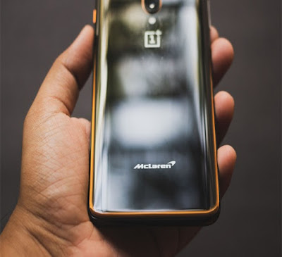
The most obvious is that the mobile phone as a whole is black. In the past, black was not worth mentioning as a regular customer, but this year it was only blue. Means wanting black is only available in the McLaren Edition.
Of course, like the 6T, there is also a circle of orange behind the 7T Pro. This part is more obvious only in the light.
There are other orange parts on the phone. The camera module is surrounded by an orange circle. The mute switch is also painted in orange, which is very conspicuous. Originally thought that the USB port would have orange like the charger but it didn't.
The McLaren version of the glass has a texture under the cover and will light up under light. It may look like wood grain at first, but it is actually the carbon fiber texture of the McLaren sports car interior. Interestingly, although the texture continues from the top of the phone to the McLaren logo, only a part of it can be seen from any angle, and the full picture cannot be seen.
However, the objects we asked, including the reviewers themselves, did not like the texture. It's like you know the sports car interior is used to show off your skills, but it's not the same thing for mobile phones.
In addition, the silver texture is fine in a silver-gray sports car, but it is very dazzling on a black phone.
For us, it was the designer who tried every means to incorporate some of McLaren's elements, but it was counterproductive. Last year, McLaren's 6T was not as good as the 7T Pro. Incompatible with the design of other parts of the phone. Of course, if the mobile phone is white and blue and the same as the sports car, then it is another matter.
Hardware of OnePlus 7T Pro McLaren
As before, the 7T Pro of the McLaren Edition is basically the 7T Pro. Compared with 6T, the difference is much smaller, the only difference is memory.
The McLaren 7T Pro has 12GB of LPDDR4X memory, while the standard version only has 8GB. The others are exactly the same, with no gaps in performance.
Software of Oneplus 7T McLaren
The final component of this McLaren is software. Again, basically the same as the Android 10-based OxygenOS 10 running on the 7T Pro. Both are in the same release cycle and therefore receive periodic updates at the same time.
However, the McLaren Edition has a few additional items, and there are only 4 categories: themes, icons, wallpapers, clocks.
The McLaren theme has been around since last year. It's basically a dark theme with an orange hue. If you look closely, you can see the same paint on the background of the notification bar as the outer box. If you are tired of orange and black color matching, you can also change other built-in themes.
However, this is probably the laziest icon pack in history. Only OnePlus' own app and Chrome have icon changes, and the icons of other pre-installed apps have a black circle. What's more, the newly installed icon directly uses the default one.
This simply goes against the original intention of the icon pack. Even the $ 1 custom icon in Google Market is stronger than this. Therefore, it may be better to use a third-party icon pack directly, which looks more uniform.
There is wallpaper. Last year's four plus the new four, one of them was an animation. Except for orange, these wallpapers have no McLaren's characteristics, and the animation is done well.
Finally, there is the clock, which can display the dial on the semi-hearted screen display interface called Ambient display. The clock has a glowing orange outer ring and hands that looks dazzling. It's easy to think of McLaren's in-car dashboard as the coolest part of the add-on.
In addition, the animation of fingerprint recognition is also McLaren limited. There is still a difference between the font of the clock widget and the screen display. When the phone starts up, there will also be a hive texture splash screen.
Previous article
Next article


I have enjoyed reading your post. It is well written. I am appreciating your effort. You can also check our blog: Personalised one plus 7t pro back covers
ReplyDelete